Spring Mountain
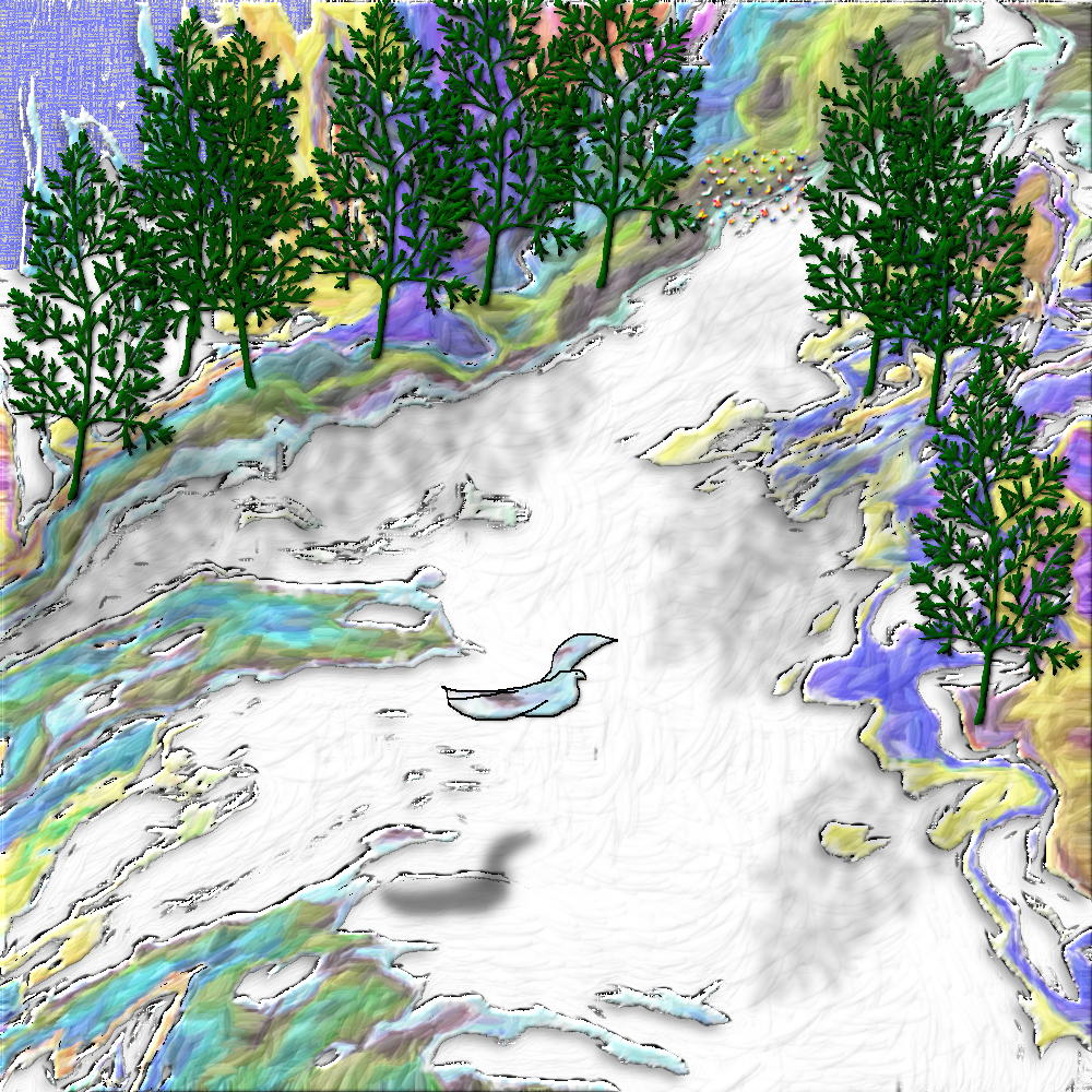
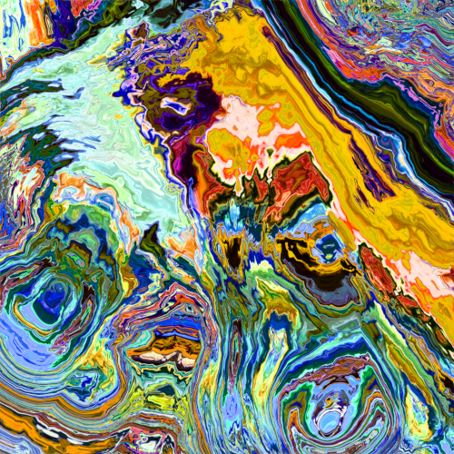
This started out as an abstract background from Creative Fabrica. Rather than shrink it to the size of my canvas, I simply cropped it. This isn’t what I planned on doing, but it’s what I saw in the abstract design.

I started with this:

It was about 3000 pixels wide. I divided it into a 9-patch and used the upper left patch. After I cropped it, I lightened it. That’s when I “saw” my image.
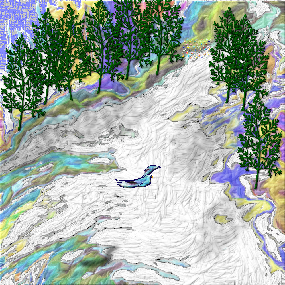
I canvas-ized the image, but it was still too flat for me. I knew I also did not want the light effect that relief light creates. I ended up selecting all but the white and using G’MIC’s brushify filter. I also beveled the edge of that brushified area and added a 50% drop shadow.
The bird was part of that brushified area, but pareidolia made it a bird, so I copied it to another layer and erased it from the brushified layer. I outlined it, and deleted and pushed pixels around until it was only the bird (ish) shape. It also got beveled once or twice more.
The tree and the butterflies are Creative Fabrica clipart. I shrunk and beveled both. The tree was duplicated eight times. The bird, trees and butterflies were all given a drop shadow that I moved to look like sunshine shadows. To makes them stand out more I also gave them a drop shadow with only two pixels offset. Only one pixel might have worked with the beveling, but I like how that worked out.
The “snow” was a little harder. It definitely wasn’t right as the base canvas-ized layer. Nothing I thought would work, did. Finally, I ended up making it a separate layer between the canvas-ized layer and the brushified color. Then it was also brushified. That gave it the wind sculpted snow look I wanted. By putting it under the “Land” area, it looks like a snow covered (probably dry) stream. The only remaining “canvas” is the blue in the upper left.
Hmmm . . . A stream would not be dry in melting snow. I didn’t catch that until I just now saw it.
I went back and put the snow layer and its drop shadow above the land layer. It’s very subtle, but now it looks more like snow on the ground. Well, then I brushified it a few mor times, too

I also moved the bird’s shadow, to be more in line with the length of the tree shadows (still not quite enough, but much better) and intensified her color, moved a couple of trees slightly, and removed the extra drop shadow from behind the butterflies. They’re too far away to stand out so much.
I honestly don’t know if this is done or not, but it is done for now. I can’t think of anything else that might make it better.
2 thoughts on “Spring Mountain”
amazing that you did this…amazing that there are
words to describe the process
I’ve been playing with digital graphics for nearly 30 years, so it’s just simple digital play for me, now. It is kind of awesome, though (not my stuff particularly, but the process).
Comments are closed.