Playing
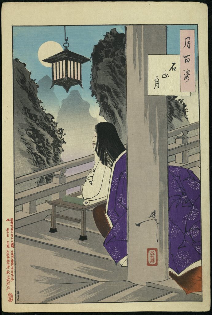
I was reading blogs yesterday and Dee mentioned the Paris Collage Collective. I didn’t know what that was, so I looked it up. I ended up downloading this week’s picture and played with it all evening.
Technically, I didn’t really do a collage. I did, however work with multiple layers, cutting out and repasting sections and adding multiple filters.
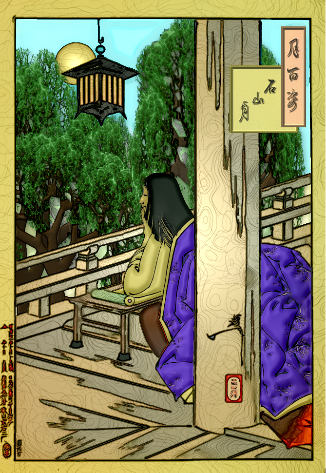
I used the comic book filter, which smoothed and intensified the colors, and added relief light with very low smooth light, which gave the wood it’s grain lines (and a whole lot more filters I can’t remember if I used or not). GIMP makes a tree, so I made several and modified the shape and added relief light to give them some depth. Those are more or less in the same spot of the trees in the original. I also tinted the gray trees green on the original, but where they show through the added trees, they seem to be tan and gray again. A copy of the moon was given a light glow filter and replaced. Then I cut out everything in the background from a copy of the comic book/relief light layer and placed it over the trees and moon which were over the first altered layer. Low level smooth light does not make good faces or softness so I cut out the woman and her blanket from a comic book copy and added relief light with some darkness added and a higher level of smoothness. I love how the blanket and her shirt look soft. (I should have done the red pillow!) I beveled the frame of the whole, the small red one at the bottom of the post, and the frames and words in the top right. Although they turned out okay, I don’t like how the trees work with the total image. (I don’t think they are trees after all. Probably mountain cliffs. Funny, last night I was certain they were trees.)
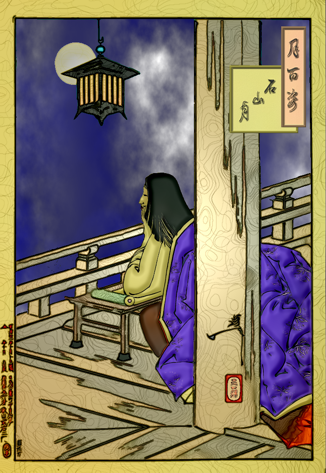
I took out the trees and changed the bottom layer to a dark blue and between the bottom layer and the cut out layer I put in the glow moon and a cloud filter layer. This deck must be high in the mountains.
Which made me think . . .
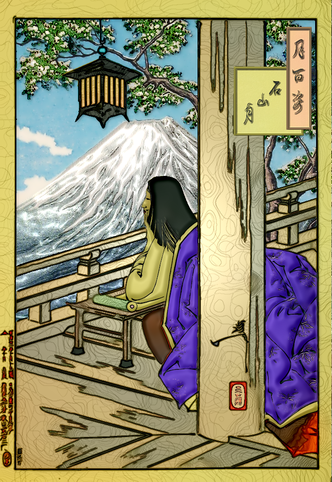
This one has an old painting (by Takahashi Hiroaki) as the background. I don’t know why I didn’t make it a bit smaller, so it would show more. If she looks down over the deck rail, she’ll see sailboats. In this one I did relief light on the tree and mountain and smoothed out the color of the sky. I think this is my favorite of the three.


